
Are you wondering, “How can I keep my website’s visitors more engaged?” Then creating a fun 404 error page should be at the top of your priority list.
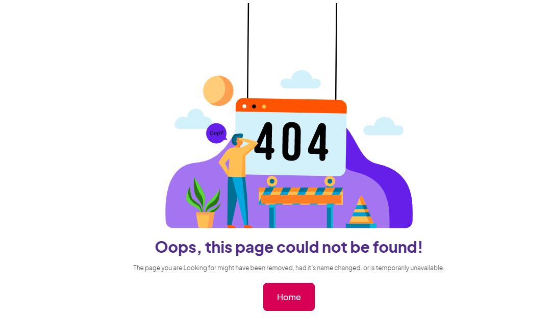
A 404 page is an error communication that occurs when a web page cannot be found, which frequently occurs due to the web page being moved or removed, or when an incorrect URL was typed in.
In either case, you have an excellent opportunity to be helpful and direct the user to a useful page and showcase your company’s tone of voice or even what your company does.
Don’t miss out on this opportunity to make your users feel good and even entertain them with a clever animation or witty copy.
When they arrive at a 404 page, most visitors will click the back button and navigate to another site.
Let that not happen with your site. Here are
4 ways to design an effective 404 page:
1. Redirect the audience to the home page and re-engage with them:
Keep the 404 page short and to the point. Provide the user with a few critical options for where to go after discovering this error. Confronting the user with a few links like that of the home page, rather than a wall of information, gives the user freedom to click on the link he prefers.
Companies like Dropbox remove the redundant header and footer navigation on their 404 page. Instead, they give links like Home, Help Center, Sign-in, etc. on the Error 404 page.
2. Include humorous content to excite your audience:
Visual puns are entertaining and are great for a giggle. Rather than having a frustrated user leave the page, include fun content that can engage your audience.
Redfin, a real estate brokerage business, has used this wisely. Their 404 page shows a house tied to a bunch of hydrogen balloons flying away, with a line that says, “Oops…Lost that one.’ This is immediately followed by a link to give feedback on the missing page’s content. This is sure to keep their website users happy.
3. Apologize for the error and offer rewards to entice them:
Who doesn’t love dogs? That is what even the e-commerce giant Amazon thought while designing its Error 404 page. With the vast array of goods and services available, Amazon usually has no trouble keeping users interested. The 404 page contributes to the brand’s friendliness and relatability by linking to ‘Dogs of Amazon,’ a page that lists the names, breeds, and favorite toys of Amazon employees’ dogs. In this case, the page can be personalized by displaying related or recommended items on the 404 page based on previous pages viewed by the viewer.
In the same way, you can keep the audience engaged by offering an apology and guiding them to some tips, tricks, or other facts they might be interested to know.
4. Add an easy-to-fill contact form to encourage them to stay in touch:
A 404 page need not always include images or animations to catch the user’s attention. Depending on the user’s needs and persona, your company may want to get right to the point. Create a simple and concise page with an easy-to-fill contact form. Decision fatigue can set in quickly, especially when a user can’t find a page they’re looking for. Adding a simple contact form on the error page assures your audience that their feedback is valued.

Conclusion:
A 404 error is rarely a reason to celebrate. However, the appearance of a 404 page does not always imply that the desired information is not available at all. In many cases, the solution to the original error is readily available, and the visitor is quickly directed to the web page they were seeking.
Following these tips can help you create a customized Error 404 page and ensure that your website visitors don’t drop off.
Looking for an expert digital marketing company to strengthen your marketing landscape? Talk to one of our experts.
No Comment